Quantum Hosky X Input Output
Branding Web
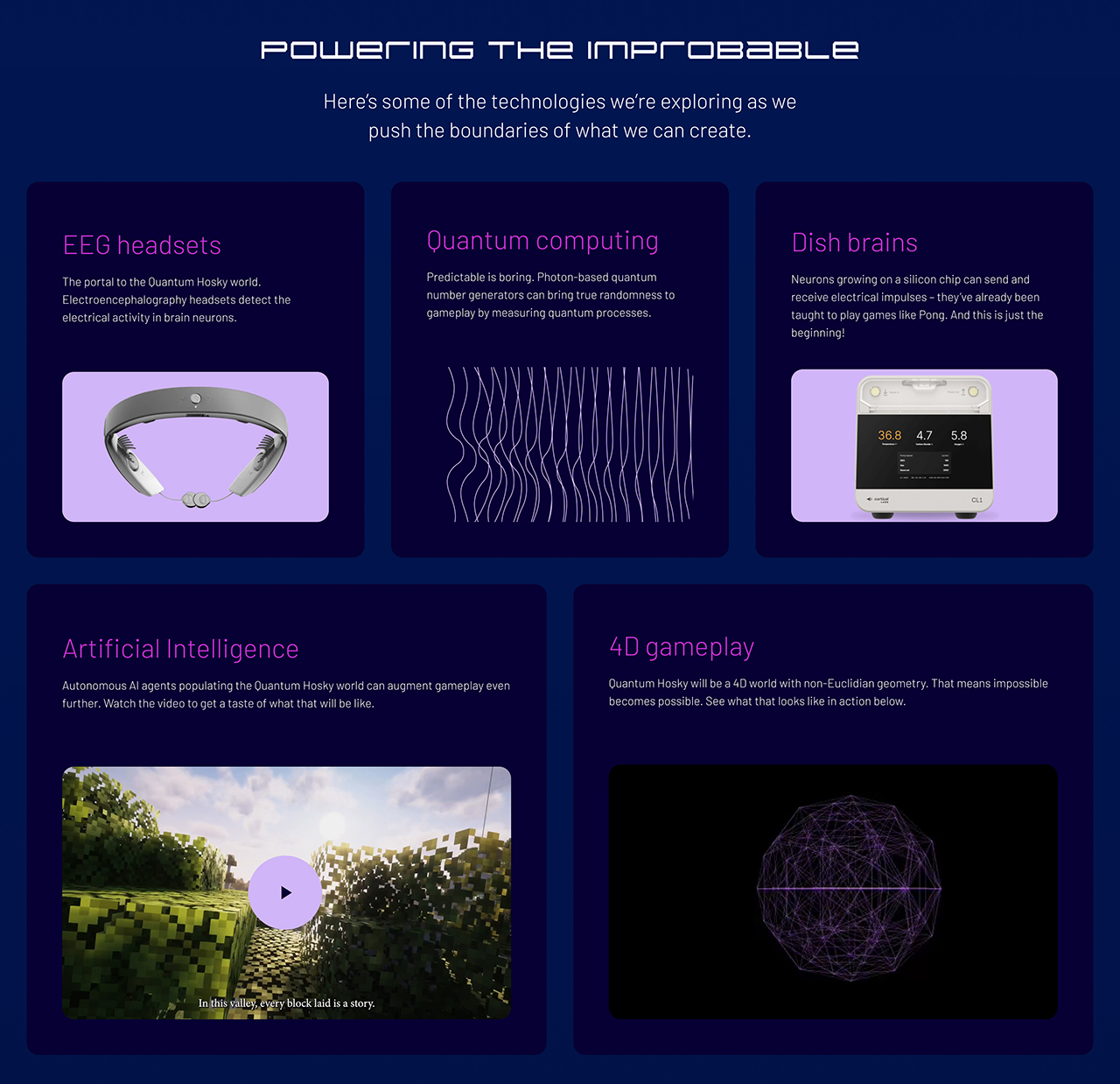
Quantum Hosky is a ground-breaking project combining the power of emerging technologies such as EEG headsets, quantum computing, dish brains and AI. Input Output needed more than a new look; they needed a brand identity as bold as their vision. A dynamic, futuristic identity was crafted to bring their story to life. An eye-catching palette, mesh gradients, and subtle micro-animations give the site an edge, capturing Quantum Hosky’s unique place in this ambitious new space.

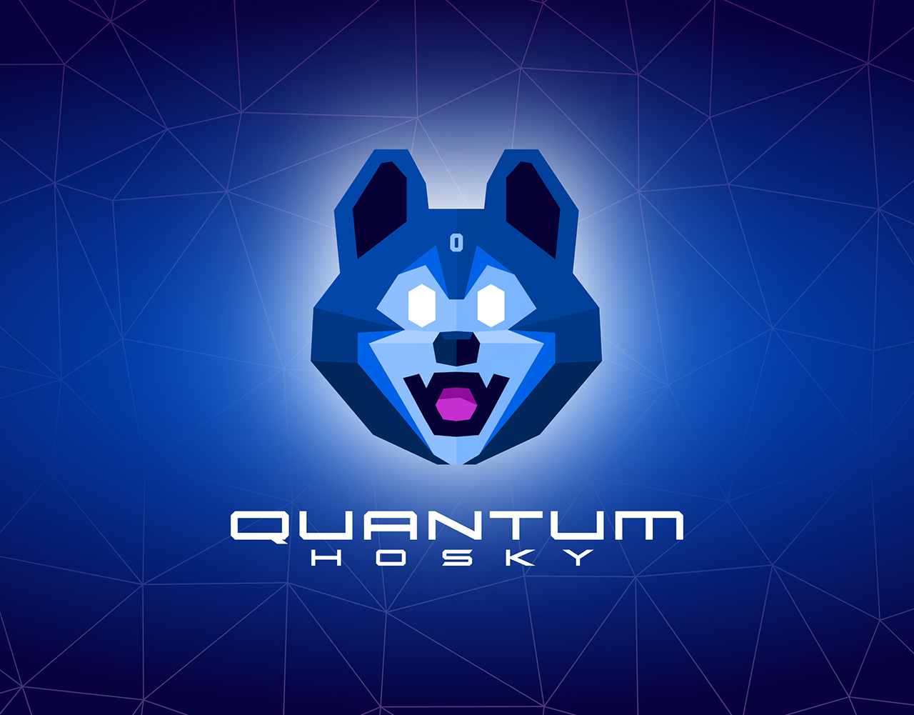
The brief was to come up with a new Quantum Hosky Brandmark, based on the Hosky memecoin Brandmark (above centre). On one hand, we needed to pay homage to the Hosky memecoin design and community. A creative and active group continually recreating re-workings of the original meme coin design (see above). On the other hand, the design needed to convey new technologies: Quantum computing, 4D gamescapes, and be a substantial progression from the memecoin design.
The design took the proportions and distribution of facial features from the original memecoin face, to retain the familiarity of the character. It was then rendered with a finish inspired by the lo-poly aesthetic synonymous with 4D renders. The video above shows the progression from memecoin design to the final Quantum Hosky design.
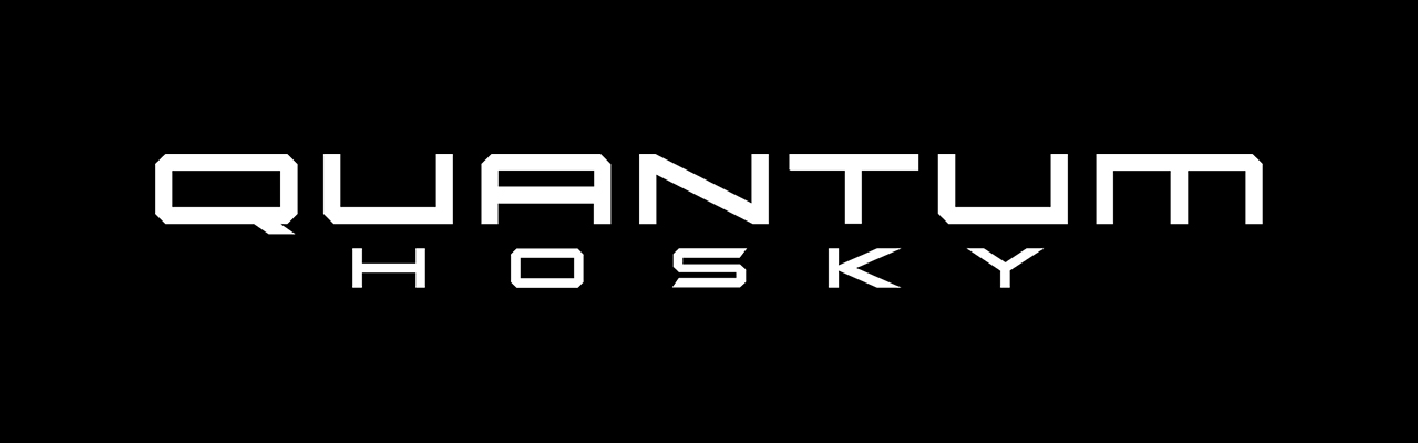
The custom logotype inspired by science fiction and space travel. The Quantum Hosky logotype is an ultra-extended typeface, taking inspiration from the angular forms of Quantum Hosky, and the Display typeface Rycon.
The Quantum Hosky demo reel shown at Rare Evo showing early renderings of the 4D Sim crafter MMO (Massively Multiplayer Online game). The ambitious concept of this completely new gaming world where headsets can read brainwaves, users can mine with their minds, play alongside DishBrains (brains harvested in petri dishes), all take place in a 4D Non-Euclidian world which evolves with the help of AI and Quantum computing!

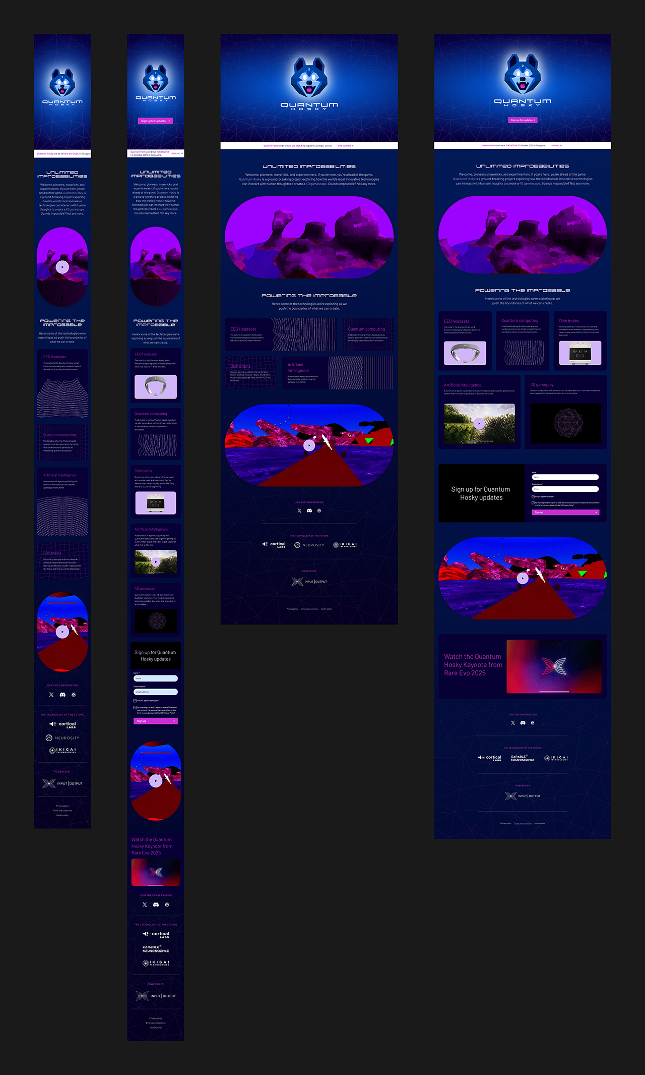
The Quantum Hosky brand identity was used for the Website designed by James Finch. I was also tasked with the design of a couple of additions to the website.
The site required a redesign of the card component for the section grid. After the V1 release, we needed a responsive card component for video and photographs, which could work on 1, 2 or 3 columns depending on screen size or device.

The sign up flow is kept clear and concise, minimising friction to increase conversions. Keeping the fields down to only 2 fields assists users with their goal without it being a chore (See below for new component additions).
Special thanks to the Input Output dream team, Paul Grizzell, Charis Hynds, Trym Måke Bruset, Ross Plummer, Kirsten Disley, Agata Staisiuk, and extra special thanks to James Finch for creative collaboration.
Check out the Quantum Hosky live site today.